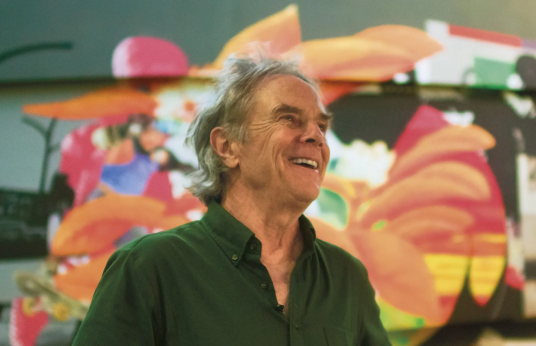
The Revolutionary
David Carson on a philosophy that transformed graphic design.
By Charles Shafaieh
As skateboarders arc through the air at Sharjah’s Aljada Skate Park, the graphic murals that envelop the space echo their energy. The work of legendary American designer David Carson, these kinetic assemblages of symbols, letters, numbers, images of skaters and bikers, and bursts of bold colour match the intensity of the tricks performed here. They also embody Carson’s style, which revolutionised the graphic-design scene in the 1990s.
“It was important to me to get local skaters in the imagery and not just the pros,” Carson says. “I wanted people to realise the diversity of those using this park. But I’m not trying to get them to examine, explain, and figure out every part of the murals. It’s more about a feeling that I hope is consistent with skating—which is fun, a little unexpected, and with no rigid rules.”
Experimentation has defined the graphic designer’s four-decade career, which began at subculture publications including Transworld Skateboarding, Beach Culture, and the alternative-music magazine Ray Gun. During his three years as art director, his radical designs helped triple Ray Gun’s circulation. Characterised as “rule breaking” by peers for what they perceived as his chaotic use of layered words and imagery, novel fonts, and an unpredictable arrangement of text, Carson dismisses it for a simple reason: He never learned the rules he was simultaneously lauded and criticised for violating.
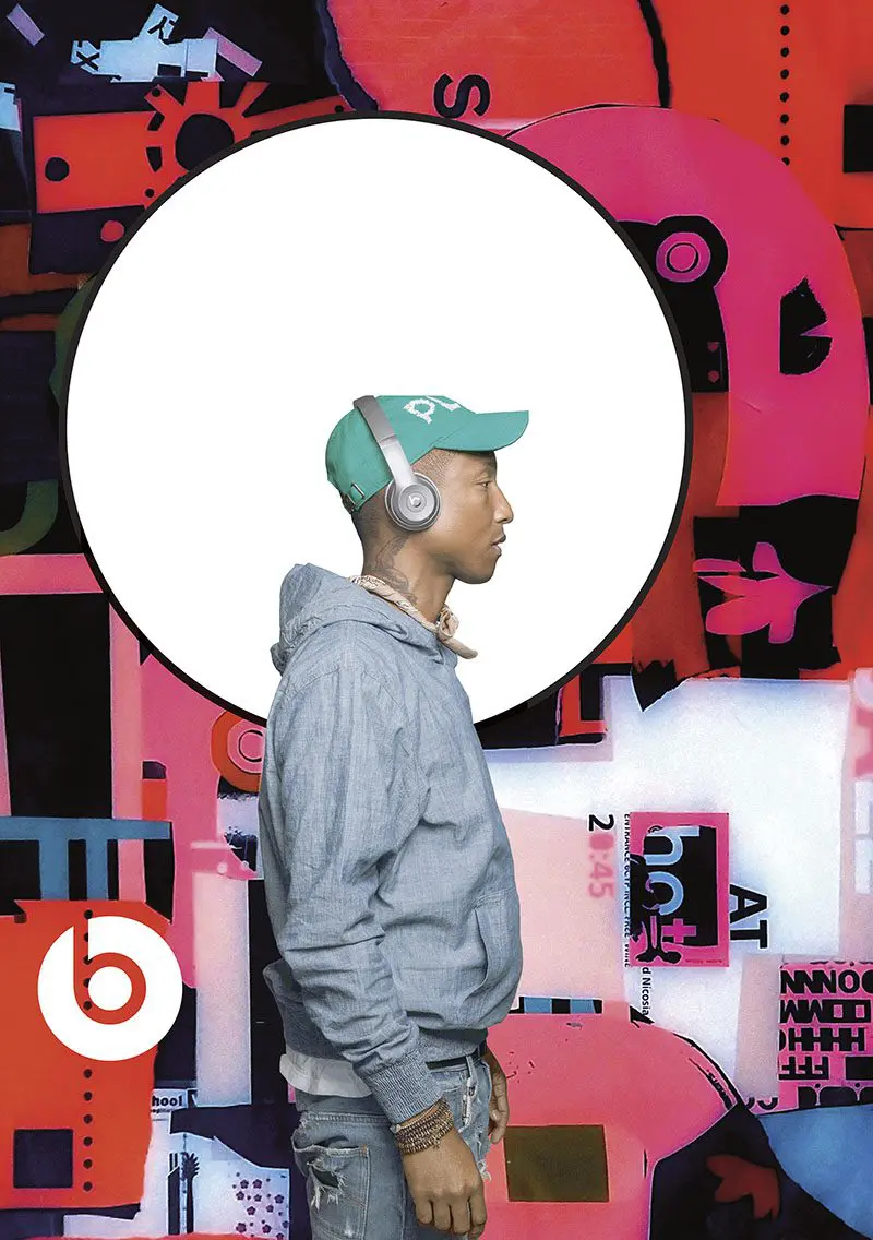
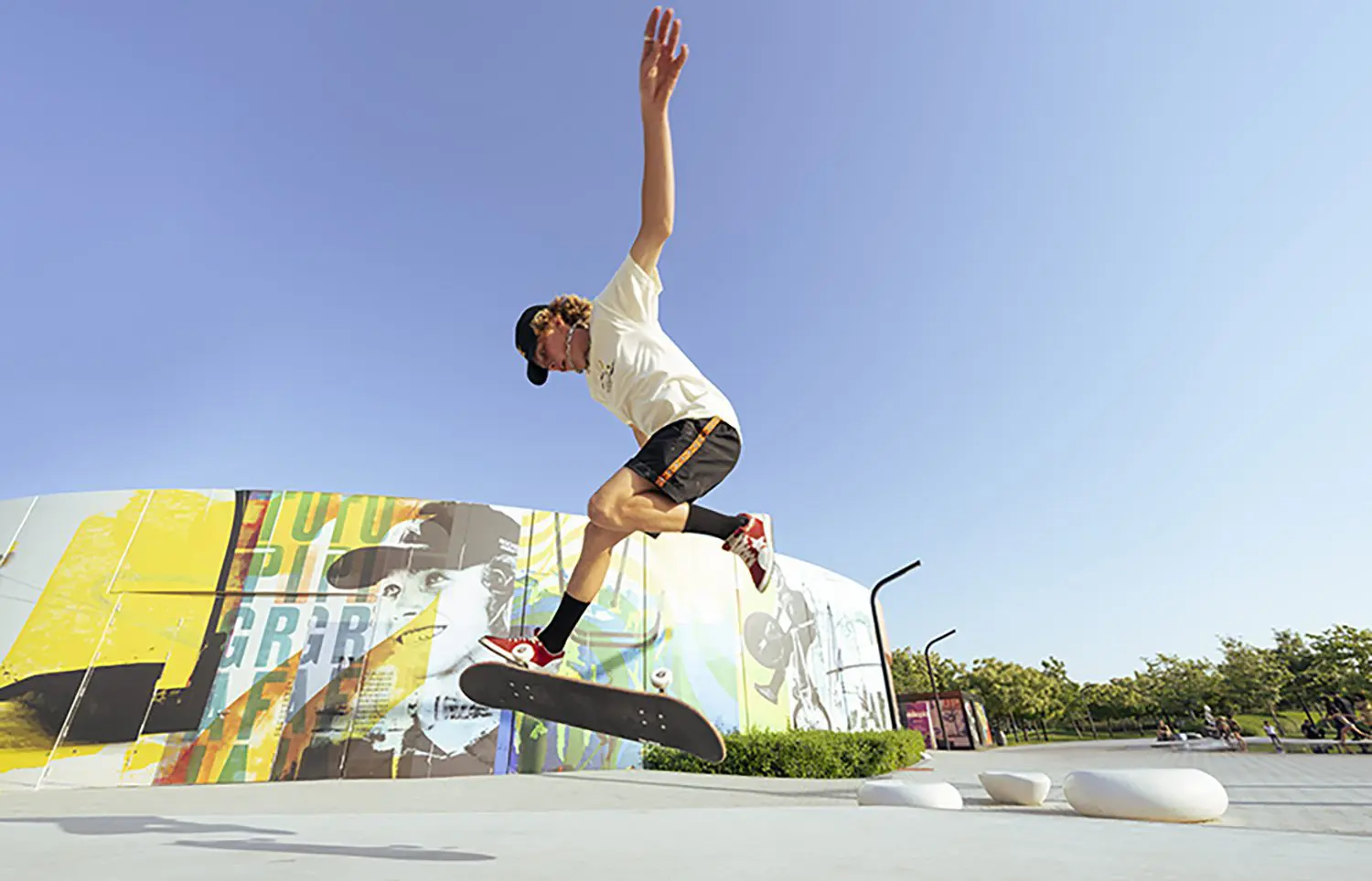
With designs, such as his campaign for Beats, Carson cares most that his work engages audiences. Above, the murals Carson designed for Aljada Skate Park in Sharjah.
Born in Texas in 1954, he spent his youth enmeshed in Southern California’s bohemian, free-thinking culture, where he was ranked as one of the world’s best surfers. After earning a degree in sociology at San Diego State University, he taught the subject to high schoolers. It wasn’t until his mid-20s that an interest in graphic design arose. But a two-week workshop with designer Jackson Boelts at the University of Arizona and, soon after, a class in Switzerland with Hans-Rudolf Lutz spurred a career shift.“Lutz did all these experimental things with photos of bands that he cut up and turned upside down or, for example, he took a newspaper article about a plane crash and played with it on a copy machine so that the physical article ended up seeming like a plane going down,” Carson says. “He wasn’t being whimsical; he had a reasoning and a thought process. And I thought, ‘Wow, this is fun and creative!’” Carson cherishes that he was never tutored by a dogmatic traditionalist. “If I had different teachers, that could have been the end of it.”
While brief, his idiosyncratic education imbued him with a sense of resourcefulness. This proved fortunate—his first magazines had virtually no budget. “I was forced to work with what I was given, which was often free publicity shots that weren’t particularly good,” he recalls. “So I’d start looking at the back of the photo for some interesting handwriting, or at the envelope, which could be scanned. Or I’d crop the photo to make it more interesting.” While today he uses a computer to speed up certain processes, his approach remains the same: no predefined grids, alignments, or settings determined by technicians without the designer’s approval.
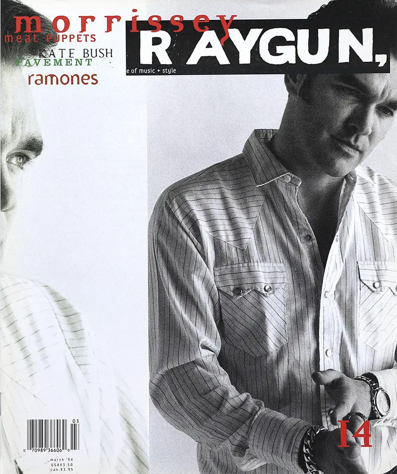
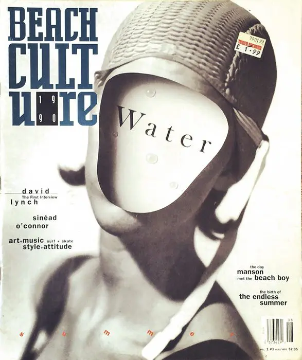
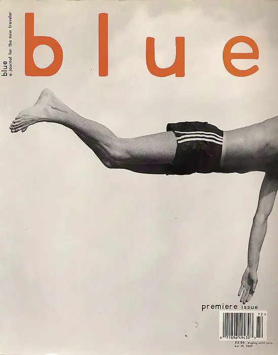
Experimentation has defined Carson’s four-decade career, which began at publications like Ray Gun, Beach Culture and Blue.
“When it’s all set up and things are dropped in the right place, with the right pull quote and initial letter bigger, it works, but it’s not risking much or getting much back in return. The viewer isn’t engaged, intrigued, or prompted,” he explains. “I don’t have a formula. I read information, listen to music, and look at any imagery I’ve been given. Then I say, ‘What am I feeling from that?’ The reader may or may not get that same thing and probably many times doesn’t, but it gets to a more interesting place.”
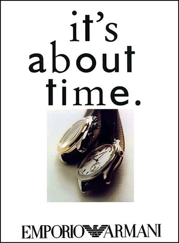
Whether with clean designs such as his campaign for Emporio Armani that featured only a watch with the text “It’s about time” or his more febrile magazine spreads, Carson cares most that his work engages audiences. Whether it is “illegible”—a complaint he heard often—is a misplaced concern.
“If something is legible, it can be read. But what is it communicating? It might be communicating ‘Boring. Don’t open me. Keep walking. Don’t click.’ Or it can communicate, ‘I want to know more’ and you’re going to walk across the street and read the small type on that poster,” he says, a nod to his sociology background. “You cannot not communicate. Everything you put down sends a message. And there’s a fine line between ‘simple and powerful’ and ‘simple and boring.’ Simple and boring doesn’t promise much—but it is legible.”
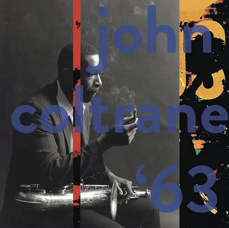
He recalls an editor at Musician Magazine who gave Carson what might be the worst possible reaction to a layout: “I can live with that.” A rush to the middle ground has only grown in the decades since, he says, in line with our dependence on technology—itself a backlash against the wild early 1990s, when everyone made their own typefaces and experimented with design.
Not only has technology made designers lazy, but it removes something which should be vital: individual expression. “There’s a humanness to my work that you can’t get from a programme or software, and I think that’s why it resonates with students and people who studied it 30 years ago,” he says. This human signature is the most important quality he encourages during the hundreds of workshops and lectures he has given worldwide.
It also cannot be taught. “Nobody has your upbringing, your parents, or your life experiences. That needs to come through in the work,” he says. “It’s usually not easy, but if your gut tells you something, you need to listen. Anybody can learn software and programmes, but nobody can pull from your uniqueness. That keeps things exciting—in any field.”
Portrait of Carson courtesy of Arada; all other images courtesy of David Carson.

