THE SPACE IN BETWEEN
Designer Samar Maakaroun takes a multilingual approach to brand creation.
BY CHARLES SHAFAIEH
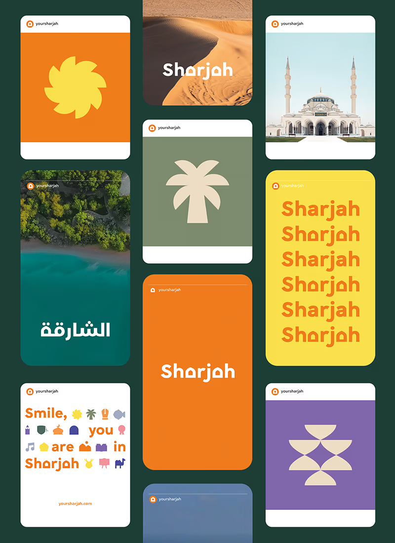
From the early 1970s, motorists entering Sharjah from Dubai were greeted by a road sign bearing the message “Smile, You Are in Sharjah.” A reflection of the emirate’s friendly character, the much-loved sign—since replaced by a floral greeting—serves as the foundation for its new brand, which launched in January.
Lebanese-British designer Samar Maakaroun created the brand to help connect Sharjah’s rich history with its ambitious arts and cultural scene and to promote it as a thriving place to live, work, and visit. She embraced the friendly tone of the old road sign by adopting it as the emirate’s slogan, and the accompanying graphic language echoes that openness through the subtle use of the arch.
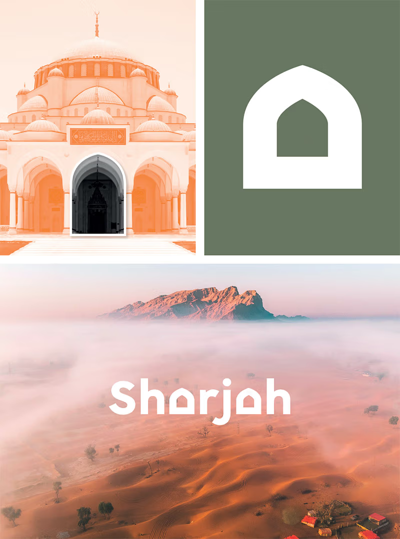
Inspired by the emirate’s architecture, from Sharjah Mosque’s riwaqs to the American University of Sharjah’s windows, the arch in the wordmark symbolises structural integrity as much as an openness to guests. Styled primarily in a vivid orange, with secondary earthy tones, the colour scheme embodies Sharjah’s bold outlook and its striking natural landscape. The wordmark was designed to work equally well in English and Arabic, and in concert when they appear together. The arch appears as a replacement for the closing “tah marbouta” in Arabic and for the lowercase “a”s in English. This subtle ingenuity introduces the idea of transitions and passages into the emirate’s name itself, which in turn embeds transformation, progress, and discovery into its identity.

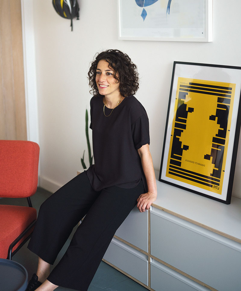
Opening image, designer Samar Maakaroun, photographed by Rick Pushinsky. The wordmark was designed to work equally well in English and Arabic, with attention paid to harmony when the two appear together. Courtesy of Samar Maakaroun and The Sharjah Government Media Bureau.
The design may appear simple, but its origins are anything but. “People think you did it in five minutes, but to get there, you have to explore all other possibilities,” Maakaroun says at the London offices of Pentagram, the world-renowned design studio where she recently became a partner. “When you’re generating ideas, you want all the play you can get.” The process, in this instance, took about six years from pitch to launch.
“Here we have a systematic approach to design,” she says. “First is a strategic phase of fact finding and immersion—interviews, conversations, comparative studies of what exists in the category—to understand, if someone already has a brand, why they are changing it.”
The answer to that question can be particularly complicated for destination brands. “How do you summarise a place?” Maakaroun asks. “What do you want to say to the world, and also to your people? Everywhere wants tourists, but at the same time, you have people who identify with it from their personal stories growing up and living there.” Timing is also a challenge because, unlike a new company, “a place is continuous.”
She speaks from experience. In 2013, Maakaroun led the design team for Dubai’s brand redevelopment by M&C Saatchi. Drawing inspiration from the emirate’s cultural fusion, the mark harmoniously combines the Arabic and Latin alphabets. Featured on number plates, websites, taxis, ministry buildings, and other facets of everyday life, the brand is widely recognised and still in use. In 2019, she developed a brand for Diriyah in Saudi Arabia with fellow Pentagram partner Domenic Lippa. The design references the small triangular windows at the heritage site of At-Turaif, with its color scheme derived from the earthy tones and rich palm greens that surround it.

The graphic language takes the arch as its starting point. The elegantly rounded motif introduces an element of transitions and passageways, that in turn embodies the ideas of transformation, progress, and journeys through Sharjah. Courtesy of Samar Maakaroun and The Sharjah Government Media Bureau.
Bilingual branding features heavily in Maakaroun’s work. Raised in Lebanon in a city close to the Syrian border, she was educated at a French school. At 17, she moved to the capital, where she attended the American University of Beirut, before moving to London for postgraduate studies. For 15 years, she designed sets for the Lebanese artist Rabih Mroué and witnessed how his theatrical pieces received different reactions around the world despite remaining constant themselves. The liminal space where cultures and languages intersect has been a driving force in her work ever since.
Her hybrid approach, which she foregrounded at the studio she founded in 2021, Right to Left, does not bias one language over the other. The result, for Sharjah, is two wordmarks that share the same DNA and which speak fluently in English and Arabic. There is parity in aesthetic and design. But this is not a given when working with scripts that possess radically different structures: one cursive, one not; one reading from right to left, the other from left to right.
“You have more neutrality in English because everybody owns English. The letters are so recognisable. It has been appropriated and interpreted by everyone,” she says. Arabic, however, provides more textural possibilities than Latin languages. Kufic script, for example, originally eschewed vowels and diacritical marks. Maakaroun encourages a spirited approach to Arabic as it allows for so many levels of play—even for designers who do not speak it. “In design, you work with shapes, and the more you play with them, the more you free the script to explore different avenues,” she says. Like children, whom she admires for their lack of creative inhibitions, those who don’t know how the letters connect or how diacritics function can experiment, under her guidance, in ways that native speakers might consider irrational.
Regardless of language, Maakaroun understands that communication is never 100% clear. She witnessed this with Mroué’s theatre and now sees it with brands, too. “You can never control how things travel,” she says. All she can do is offer a solution which is clear and to the point, in colour and shape, and hope that it will resonate. “You want something as simple as possible that can live everywhere, big and small. It needs to be memorable for the long term—a mark that endures.”


